A bolder Sandvik

On September 21, Sandvik launched a new brand identity. It symbolizes the transformation into a “new” company, focusing on future growth areas such as digitalization and sustainability.
You may have noticed that Sandvik is looking different lately – a little more future oriented, progressive, and bolder.
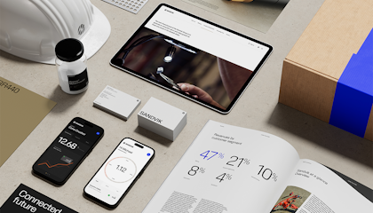
The new brand platform for Sandvik Group was launched on September 21, with a design and logo that is quite a departure from the company’s traditional blue, orange and white brand.
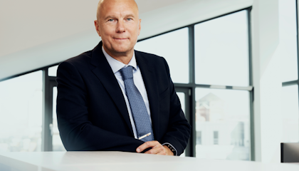
“We want to convey the future Sandvik which is more digital, sustainable, collaborative, modern and attractive for our different stakeholders,” says Björn Roodzant, Head of Group Communications and Sustainability.
The new brand platform has been designed to better represent the brand personality of Sandvik and the shift to future growth areas such as automation, digitalization, electrification, and sustainability.

Sandvik has acquired many new companies the last couple of years, many of which are in the digital technology realm. There have also been numerous changes following the separation of Sandvik Materials Technology (renamed Alleima) from the Sandvik Group in 2022. “This is a strong reason to ensure that stakeholders know what Sandvik stands for today and tomorrow,” says Roodzant.
This symbolizes our role in bringing our customers upwards and onward.
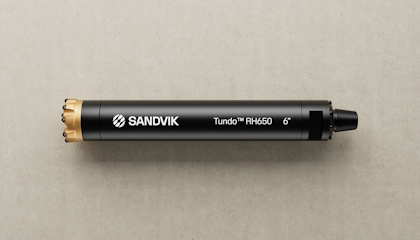
Many years have passed since the last logo change which, aside from a small adjustment in 2014, took place in 1983. The new Sandvik logotype, inspired by an earlier 1962 version, adds a round, more modern, and high-tech symbol to indicate the company’s purpose to make the shift and advance the world through engineering. “This symbolizes our role in bringing our customers upwards and onward. It also represents circularity, the planet, and being a global company. We are building on our long heritage, but becoming more sustainable, digital and future oriented,” says Roodzant.

We are building on our long heritage, but becoming more sustainable, digital and future oriented
The new black and white color scheme with a touch of gold is designed to harmonize better with the different brands and color schemes within the Sandvik family. It will be more aesthetically pleasing for example, when showing brand collaborations and endorsements in different settings such as trade shows, Roodzant points out.
“It's our Sandvik Group identity but we’ve also built a flexible setup for our different brands within the group. Brands in the portfolio can keep their names, colors, and logos, but on some platforms, they will also showcase being part of the larger Sandvik Group.”
While the previous logo was boxed in, the new design is more dynamic and easier to apply in different contexts. “Freeing up the Sandvik logo from its box will help in digital applications. The previous identity was not fit for purpose in the digital world as the colors were not fully user friendly on a digital screen,” Roodzant adds.

Although the initial brand transition has taken place in digital channels and at key sites, the full brand identity transformation will extend over a three-year period. “This is smarter from a sustainability perspective, and well perceived by customers, owners, and employees, ” says Roodzant, pointing out that the company will continue to use equipment and materials branded with the old Sandvik logo until they are ready to be replaced due to natural wear and tear..
Many people were engaged in the branding project, working together under wraps to ensure its success. “People at the company have seen the need for a new brand identity,” says Roodzant, who is also the project leader. “I’m proud of the engagement from everyone and happy to make it a reality.”